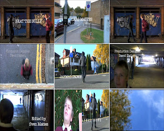
1st frame: In this frame we chose the title of the film to go where the characters first meet. The reason for this is because it is the part of the opening where the tension builds up to.
We did choose the title 'Beat the Bully' because the main character gets bullied and he will fight back.
2nd frame: The setting/location of the film is set near the Grafton Centre, and the part where the gang leader is introduced is by Coleridge school.
We chose these locations because they represent the genre of the film, and makes it look and feel like a regional independent film.
3rd frame: In this frame it shows how we used costume and props. The costumes that we chose to use for the main character (Lars) was his school uniform to make him look like he is coming back from school. We also used one prop for this character which was his school bag, to make it even more convincing to the audience that he is a school boy.
For the gang leader (Jahmal) we made him wear a hoodie with the hood up, jeans with turn ups at the bottom, and black nike trainers. This makes him look scary towards younger people, which is why when he passes the main character, he looks scared. We made sure that you can't see his face to make the audience wonder what he looks like, who he is, and what will happen later on in the film.
4th frame: The reason why we made this helicopter shot, is because we wanted to have a variety of shots and wanted to make our film opening as interesting as we possible could. We wanted to have a shot that is different from all our other shots, and what other people didn't add to their films and is very hard to do.
5th frame: This frame shows how we used titles and font style. You can't see it in this picture as it is a still image, but in the film the separate letters of the titles move together to form the title. The style which we used is (American Typewriter) and we had the font colour white as it showed up well on the background of the film.
6th frame: This frame shows how the opening of our film sets up as it is the crucial scene when the characters pass each other. This shot shows the main character (Lars) looking scared after seeing the gang leader (Jahmal) who looks menacing as he looks back. This shot also shows how the story will evolve later on.
The story is explained in our pre-production posts.
7th frame: In this frame we wanted to show the genre of our film which is 'An independent movie featuring a young protagonist' similar to Kidulthood/This is England.
We chose this shot because we wanted to show that it has a young protagonist in it, as well as a kidulthood like character with his hood up in the distance.
8th frame: We did a split screen of how both characters are introduced. In the left hand shot it shows the main character (Lars) on the floor in a close up shot, and this is how we introduced him. In the right hand shot, it shows a mid-shot of the gang leader (Jahmal) walking across the street, and this is how we introduced him.
9th frame: This shot is at the beginning of the film opening and it shows a POV of the main character looking into the sky after being pushed to the ground. The reason why this is a special effect shot is because we blurred the picture to make it look like he is dizzy and confused so the audience really get the feel of what's just happened.
No comments:
Post a Comment