L3 OPENING SEQUENCE - GROUP 7 - FINAL VIDEO from cmdiploma on Vimeo.
Monday, 16 November 2009
Thursday, 12 November 2009
EVALUATION ACTIVITY 1
In what ways does your media product use, develop or challenge forms and conventions of real media products? (i.e. of film openings)
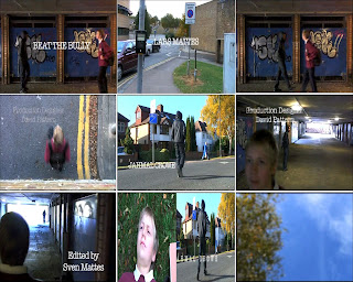
1st frame: In this frame we chose the title of the film to go where the characters first meet. The reason for this is because it is the part of the opening where the tension builds up to.
We did choose the title 'Beat the Bully' because the main character gets bullied and he will fight back.
2nd frame: The setting/location of the film is set near the Grafton Centre, and the part where the gang leader is introduced is by Coleridge school.
We chose these locations because they represent the genre of the film, and makes it look and feel like a regional independent film.
3rd frame: In this frame it shows how we used costume and props. The costumes that we chose to use for the main character (Lars) was his school uniform to make him look like he is coming back from school. We also used one prop for this character which was his school bag, to make it even more convincing to the audience that he is a school boy.
For the gang leader (Jahmal) we made him wear a hoodie with the hood up, jeans with turn ups at the bottom, and black nike trainers. This makes him look scary towards younger people, which is why when he passes the main character, he looks scared. We made sure that you can't see his face to make the audience wonder what he looks like, who he is, and what will happen later on in the film.
4th frame: The reason why we made this helicopter shot, is because we wanted to have a variety of shots and wanted to make our film opening as interesting as we possible could. We wanted to have a shot that is different from all our other shots, and what other people didn't add to their films and is very hard to do.
5th frame: This frame shows how we used titles and font style. You can't see it in this picture as it is a still image, but in the film the separate letters of the titles move together to form the title. The style which we used is (American Typewriter) and we had the font colour white as it showed up well on the background of the film.
6th frame: This frame shows how the opening of our film sets up as it is the crucial scene when the characters pass each other. This shot shows the main character (Lars) looking scared after seeing the gang leader (Jahmal) who looks menacing as he looks back. This shot also shows how the story will evolve later on.
The story is explained in our pre-production posts.
7th frame: In this frame we wanted to show the genre of our film which is 'An independent movie featuring a young protagonist' similar to Kidulthood/This is England.
We chose this shot because we wanted to show that it has a young protagonist in it, as well as a kidulthood like character with his hood up in the distance.
8th frame: We did a split screen of how both characters are introduced. In the left hand shot it shows the main character (Lars) on the floor in a close up shot, and this is how we introduced him. In the right hand shot, it shows a mid-shot of the gang leader (Jahmal) walking across the street, and this is how we introduced him.
9th frame: This shot is at the beginning of the film opening and it shows a POV of the main character looking into the sky after being pushed to the ground. The reason why this is a special effect shot is because we blurred the picture to make it look like he is dizzy and confused so the audience really get the feel of what's just happened.
EVALUATION ACTIVITY 2
How does your media product represent particular social groups?
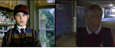

For this task we have decided to get a screen grab of our main character 'Lars' and compare it to a screen grab of the main character 'Marcus' in About a Boy.
Marcus from About A Boy has many similarities with our main character, and these are a few examples. In appearance they both look very depressed and are pulling the same facial expression.
They are wearing similar costumes as each other as well, as in our film the main character has his school uniform on showing that he has just come back from his school day. He also has his bag on his back, similarly in about a boy Marcus is wearing his school uniform and he has a bag on his back, but there is a difference in both screen grabs as Marcus is wearing a hat on his head and also a very odd sweatshirt. Also on his uniform he is wearing a tie.
Both characters have a very similar role in each film, and they both have almost exactly the same personality. Marcus gets bullied at his school because he is a very strange boy, however, in our film our main character gets bullied at school but not for the same reasons. Lars gets bullied at school because he is very clever and knows every answer the teacher asks him and other students don't like him for it. The role of each character is to play a young school boy who gets bullied at school and need to find a way out of bullying.
In our film our character tries to get into a gang, whereas in about a boy 'Marcus' tries to make friends with one of his parents friends.
EVALUATION ACTIVITY 3
What kind of media institution might distribute your media product and why?
Here is some additional information we were asked to put into the commentary but did not because a commentary normaly relates more to the opening than most these questions do.
For this task we had to create a commentary voice over, to put over the top of our film opening sequence. The commentary is explaining what is happening in each scene and why we chose to make it in that way.
I think that making a voice over was a good idea, because people now know what is happening correctly, as the editor and director (Sven and Jahmal) of the film are the ones doing the commentary, so this gives the audience a clear idea of what is going on in each important scene. It also makes sure that people watching notices all of the little details, which they would have never seen before, which makes the film opening twice as interesting to what it would have been if they just sat down and watched it, without spotting the small details.
Because we know all of the little details added by us, we have a brilliant understanding of the film opening, and know what is going to happen later on in the film. Knowing all details makes the film stand out more, because the audience will be looking out for these minor effects, which is why we chose to add a clear and accurate commentary version of our film opening sequence.
Here is some additional information we were asked to put into the commentary but did not because a commentary normaly relates more to the opening than most these questions do.
What does a production company do?
The production company are the ones who produce the film, for example, in relation to our
opening we put our idents at the start of the film, showing that we produced it.
What is a distributor and what is he doing?
A film distributor is an independent company, he is the agent between the film production company and the film exhibitor.
Where the money might have come from for a film such as yours?
The money for our film might have come from government grants, because our film is an independent local feature.
Why the various people are named in the titles?
We named our film production companies as well as actors in the opening on the other hand we have not mentioned small jobs such as boom operator. That is because main jobs such as director are more important than boom operator. And they are named in the opening because more people are going to see the opening and not the credits of the end of the film.
Our titles are:
J.C.A.C Media productions and Sven Mattes Film and Media Production present
a Crowe and Mattes film
LARS MATTES
JAHMAL CROWE
Casting by Bill Noxville
Costume Designer Alex Hume
Sound Designer Karlos Jimenez
Edited by Sven Mattes
BEAT THE BULLY
Producing Designer David Pattern
Screenplay by Johnny Traffer
Produced by Collin Smith
Directed by Jahmal Crowe
We took the order of the title appearing from a template, which is similar to the opening of 'Fight Club'.
What your film is similar to 'institutionally'?
The films that would be released in a similar way would be for example 'Man on Wire', 'In Bruges', and 'Slumdog Millionaire', because all of these films are British Independent Films.EVALUATION ACTIVITY 4
Who would be the audience for your media product?
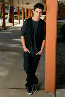
This is our target audience.
How old are they?
They are 16 years old.
What are they called?
Teenager. His name is Louis.
How do they dress?
Nike trainers, straight cut jeans, and expensive jumpers.
Where do they live?
In a semi-detached house.
What do they spend their money on?
Clothes and console games.
Where do they watch films?
In cineworld, and illegal downloads on internet.
Do they play video games? Which ones?
Yes, Muliplayer games, online games like Call of Duty and World of Warcraft.
What is their favorite film?
Adulthood.
How much TV do they watch?
1-2 hours a day.
What do they do in their leisuretime?
They play console games, and listen to music.
What kind of music music do they like?
Grime, Hip-hop, and Rap.
Do they buy music?
No, they download illegal copies of music.
EVALUATION ACTIVITY 5
How did you attract/address your audience?
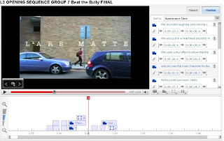
This is a screengrab of the annotations editor in YouTube..

This is a screengrab of the annotations editor in YouTube..
We added some annotations to our video so that we can describe how we relate our characters to other films. We explain that our main character (Lars) is similar to Marcus in 'About a Boy'.
The gang leader in our film opening relates to some of the characters in 'Kidulthood' because he is wearing hoodie and gangster clothing.
The screengrab shows the timeline of YouTube's annotations program.
The annotations which we added, shows the audience what we intended to do in the film, and shows how everything works, in order to draw the audiences attention towards the film.
On the timeline it shows where we added text. It was very hard to get the text to come in at the right place and fade out at the right place, so we really had to concentrate very hard. We also had to do annotations for each scene. Doing this, shows that we have a great understanding of why we chose to do what we did, and lets the audience know that we didn't just come up with it on the spot.
EVALUATION ACTIVITY 6
What have you learnt about technologies from the process of constructing this product?
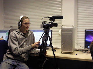
This photo shows all the equipment which I have used to create the film opening, as you can see there is a mac in the background and we used this mac to do all of our editing using programs such as: GarageBand, Final Cut and Photoshop. We also used websites such as, Blogger, Vimeo, Youtube, and Flickr.
There is also a camera with the microphone and tripod. We used the camera obviously to record, and the tripod was to keep steady shots, but we didn't always use steady shots as we had some over the shoulder shots as well. On top of the camera is a microphone which records all of the sound whilst filming, but we didn't actually use any of the sound which we had when recording because it was mostly Me giving orders (shouting action aso.); but we did record sound at a later stage.
We also used headphones whilst on GarageBand, to make our own music for the soundtrack of the film. The headphones are on my head in this photo.
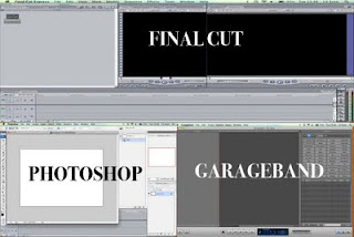
FINAL CUT
Here are some screengrabs of the main programs which we used to make our film opening look professional and not rushed.
Final Cut was the crucial program for our film, because this is where we edited everything, like cutting scenes out of our film, and putting everything in the right position, we also used it for special effects and adding titles.
In our film opening we had many special effects, like at the beginning we blurred the POV shot to make it look like blurred vision as the character has just been pushed to the ground. Later on in the film we added another special effect, where the characters meet and everything goes to slow motion for a little while creating tension.
GARAGE BAND
GarageBand was another program which we had to use to make our film stand out, because in this program we had to create our own music and we had to take lots of sounds to do this. In my opinion, by the end of making the soundtrack which we struggled with at first, it turned out to be very appealing, and actually went with the type of film we have, also if you listen carefully the tone of the music changes when it switches between characters. Another thing I think we did well, was when the characters meet, the music changes to build a lot of tension.
When using GarageBand we also had to fade the music out at the end, so we had to get the pen tool out and put dots on the line where we wanted to drag it down, then when we had it at the right point, we would play it through and it would fade out perfectly.

This photo shows all the equipment which I have used to create the film opening, as you can see there is a mac in the background and we used this mac to do all of our editing using programs such as: GarageBand, Final Cut and Photoshop. We also used websites such as, Blogger, Vimeo, Youtube, and Flickr.
There is also a camera with the microphone and tripod. We used the camera obviously to record, and the tripod was to keep steady shots, but we didn't always use steady shots as we had some over the shoulder shots as well. On top of the camera is a microphone which records all of the sound whilst filming, but we didn't actually use any of the sound which we had when recording because it was mostly Me giving orders (shouting action aso.); but we did record sound at a later stage.
We also used headphones whilst on GarageBand, to make our own music for the soundtrack of the film. The headphones are on my head in this photo.

FINAL CUT
Here are some screengrabs of the main programs which we used to make our film opening look professional and not rushed.
Final Cut was the crucial program for our film, because this is where we edited everything, like cutting scenes out of our film, and putting everything in the right position, we also used it for special effects and adding titles.
In our film opening we had many special effects, like at the beginning we blurred the POV shot to make it look like blurred vision as the character has just been pushed to the ground. Later on in the film we added another special effect, where the characters meet and everything goes to slow motion for a little while creating tension.
GARAGE BAND
GarageBand was another program which we had to use to make our film stand out, because in this program we had to create our own music and we had to take lots of sounds to do this. In my opinion, by the end of making the soundtrack which we struggled with at first, it turned out to be very appealing, and actually went with the type of film we have, also if you listen carefully the tone of the music changes when it switches between characters. Another thing I think we did well, was when the characters meet, the music changes to build a lot of tension.
When using GarageBand we also had to fade the music out at the end, so we had to get the pen tool out and put dots on the line where we wanted to drag it down, then when we had it at the right point, we would play it through and it would fade out perfectly.
EVALUATION ACTIVITY 7
Looking back at your preliminary task (the continuity editing task), what do you feel you have learnt in the progression from it to full product?
1.
Match on action shot (1. and 2.)
2.
3.
Reverse shot (3.)
4.
180 degree rule (4. and 5.)
5.
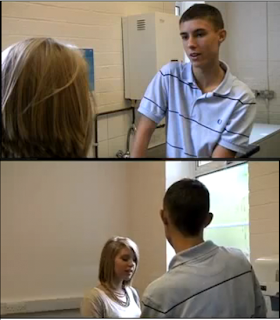
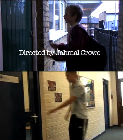
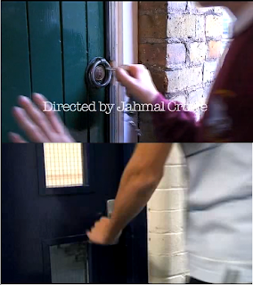
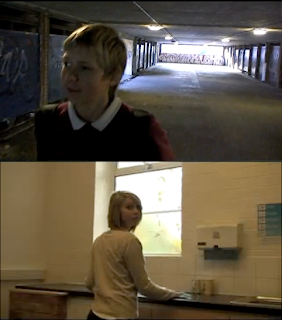
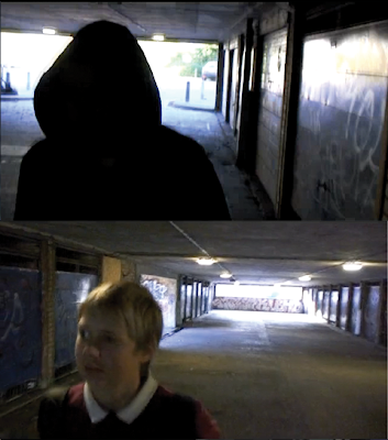
I used Jahmal's preliminary task which he made to compare it to our finished film opening.
1.

Match on action shot (1. and 2.)
2.

3.

Reverse shot (3.)
4.

180 degree rule (4. and 5.)
5.

I used Jahmal's preliminary task which he made to compare it to our finished film opening.
Looking back I feel that we have really implemented every aspects we have learned by doing the preliminary task.
In our opening we have several match on action shots aswell as used the 180 degree rule. We also used a reverse shot of both characteracs looking at eh other.
As you can see in picture 1. both characters (Louis and Lars) open a door. In the 2. picture both projects have a close up of the action. This match on action shot is used to make the audience really see what is going on.
On picture 3. you can see how both characters (Tilly and Lars) react to a certain action. This reverse shot is used to let the audience see what the other person did at exactly the same moment.
Pictures 4. and 5. demonstrate the 180 degree rule from two views. The 180 degree rule is used to see the characters are always on the same side.
Friday, 6 November 2009
Wednesday, 4 November 2009
Creative risk
We were asked to identify one risk we took while making the opening scene.
We took away the background noises of the original filmed clips because we had a lot of car noises in the background. The risk was not getting any marks for the soundtrack or that the opening sequence does not sound real enough.
Because we will paste music to the opening and we already recorded extra sounds to fit to the scenes, it was worth to cut out the distracting noises.
I would not change what we did because it is working really well.
Sunday, 1 November 2009
Feedback for Sophie and Charna
1. What did you rate as strengths of the work?
The strengths of this opening are that they used alot of different shot types as well as angles.
They also use the benefit of the night so that the fire and the titles stand out very well.
Because it is dark and the fire is the only light source, it feels like another dimension/fantasy world.
I like the music at the beginning of the opening which also gives a sort of mysterious feeling to the opening.
2. What did you rate as weaknesses?
In the middle of the opening sequence the music changes, which in my opinion does not fit to the opening.
The title with the name of the film is at the end of the opening sequence. Normally trailers have the name of the film at the end, so I think that your opening looks more like a trailer than an opening sequence.
The audience does not really know what is going on. Maybe when the fairies are edited into the opening scene it will make more sense.
3. What do you think the group should change?
I think that the group should change the music and the title with the name of the film (at a different time), nothing else really.
4. what has the other group still got to do? e.g. titles, sound, visuals
The visuals (fairies) still need to be inserted into the opening.
Sunday, 25 October 2009
Rough Cut
Because it is a rough cut is is not complete yet. We have to work on our soundtrack and titles.
Monday, 19 October 2009
Favorite moment while filming
Sunday, 18 October 2009
Film that relates to our film opening
The film 'Boyz n the Hood' starts with the story of a young boy living with his mother having disciplinary problems. Therefore he moves to his father who shows him to become a man.
Some aspects of this film are fairly alike with our opening, for example, the gang life in the film.
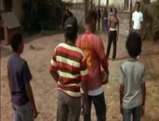
In our film the main character will join a gang. The film Boyz n the Hood also deals with gangs a lot.
At the beginning of Boyz n the Hood the main characters walk along a street from school which is similar to our opening because our main character also is walking home from school.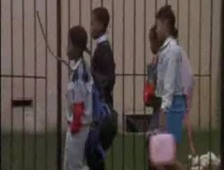

In our film the main character will join a gang. The film Boyz n the Hood also deals with gangs a lot.
At the beginning of Boyz n the Hood the main characters walk along a street from school which is similar to our opening because our main character also is walking home from school.

Saturday, 17 October 2009
Final Shootings
Yesterday we finished filming for our opening.
Because we filmed after college, I had to take the camera and the equipment home. Therefore I transfered all of the material to my computer and tried out a few editing possibilites and how it is going to look like.
Here are some screenshots of scences which we will use in the opening:
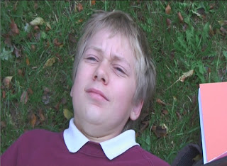
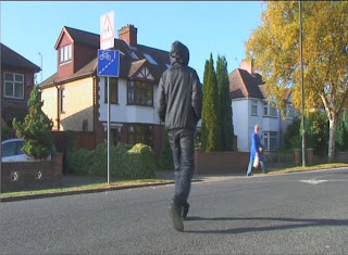
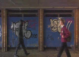
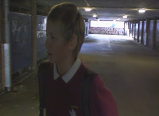
This picture shows the main character laying on the ground.
This picture shows the gang leader walking across the street.
This picture shows the characters passing each other.
This picture shows the expression of the main character to the gang leader.
We actualised every shot in our storyboard and I think we did a good job by doing that. The first edit I made of the opening at home looks pretty good, but we are going to edit the whole film opening on tuesday.
Because we filmed after college, I had to take the camera and the equipment home. Therefore I transfered all of the material to my computer and tried out a few editing possibilites and how it is going to look like.
Here are some screenshots of scences which we will use in the opening:


This picture shows the main character laying on the ground.
This picture shows the gang leader walking across the street.
This picture shows the characters passing each other.
This picture shows the expression of the main character to the gang leader.
We actualised every shot in our storyboard and I think we did a good job by doing that. The first edit I made of the opening at home looks pretty good, but we are going to edit the whole film opening on tuesday.
Friday, 16 October 2009
Working on the Soundtrack and Filming
Today we are going to work on the soundtrack for our opening.
For the bits where the gang leader is appearing we are going to look for copyright free music that is like rap, hip-hop, or grime.
We are going to use GarageBand to create the soundtrack for the main character.
Today after school we will film the last bits of our opening. We are going to meet up with Lars the main character in the opening at the grafton centre in Cambridge. We are going to shoot every remaining scene in that area. The weather does not look as good as it did the other day we filmed but as long as it is not raining it does not effect us in any way.
Today after school we will film the last bits of our opening. We are going to meet up with Lars the main character in the opening at the grafton centre in Cambridge. We are going to shoot every remaining scene in that area. The weather does not look as good as it did the other day we filmed but as long as it is not raining it does not effect us in any way.
Thursday, 15 October 2009
Storyboard

The 1st frame shows the main character's point of view, looking into the sky and blinking.
The 2nd frame shows the main character (M. C.) laying on the ground blinking and getting up.
The 3rd frame shows the M. C. getting up from another point of view.
The 4th frame shows the M. C. walikng out of the school.
The 5th frame shows the M. C. walking along a street.
The 6th frame shows again, the M. C. walking along a street with cars on the street.

The 7th frame shows the M. C. walking to a traffic light.
The 8th frame shows the M. C. pressing the button of the traffic light.
The 9th frame shows the M. C. walking to some stairs.
The 10th frame shows the M. C. walking down some steps.
The 11th frame shows the M. C. from a helicopte view walking.
The 12th frame shows the M. C. walking into a tunnel.

The 13th frame shows the M. C. walking in the tunnel, seeing a gang.
The 14th frame shows the M. C. and the gang split screen looking at each other.
The 15th frame is a reverse shot showing the 15th frame from another point of view.
The 16th frame shows the M. C. walking to some steps to get to his flat.
The 17th frame the M. C. goes to his flat's door to open it.
The 18th frame the opens the door.
Moodboard
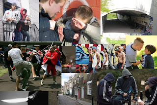
This is a moodboard I created for Beat the Bully. It shows various pictures which relate to our story.
The 1st picture shows a gang leaning against a fence.
The 2nd picture shows someone getting bullied.
The 3rd picture shows a tunnel (which we will have in our opening).
The 4th picture shows a fight between gangs.
The 5th picture shows a city at night.
The 6th picture shows gang.
The 7th picture shows someone who bullies.
the 8th picture shows a knive.
The 9th picture shows an empty street.
The 10th picture shows a gang with hoodies.
I think that through that moodboard the main picture of the opening comes across very well. It shows gangs, bullying and other images which relate to our opening.
Fontboard
Tuesday, 13 October 2009
Greenscreen activity
This is the greenscreen activity we did and I edited.
We wanted to create a look-a-like of the Juno opening.
I think that I could have make the effects better than they are now, but in my opinion, for the first time using the greenscreen effect it is not that bad
First Shootings of the Opening
Today we shot the first footage for our Beat the Bully opening sequence.
Our opening story starts with a 12 year old boy who got bullied and pushed to the ground. The audience only hears the sounds of it and sees a black screen to increase the tension, after that the main character sees the sky and blinks.
He gets up and starts walking home. On the way home he walks past a gang.
This character is our main focus in the opening.
Today we thought that we could introduce another character which is the gang leader.
He is also walking and is meeting up with his gang.
Because we want to show a difference between these two characters we shot the gang leader (Jahmal) handheld and we are going to shoot the main character (Lars) on a tripod only (steady shots).
We have done some various shot with Jahmal in which he walks, waits, and him crossing the road.
We basically got every shot we need for the gang leader apart from the bit where he and the main character pass each other.
This was a session which was very productive as well as fun.
Monday, 12 October 2009
Tomorrow's session
In tomorrow's session we have to shoot a bit of our opening sequence. But because we do not have the actors available tomorrow we only are going to shoot the first shot and some other shot without the actors.
The actors in our opening cannot attend tomorrows shoot because they are in school. We would shoot the other scenes with the actors on a weekend.
Because we can't shoot many scenes tomorrow we are also going to work on the soundtrack.
Sunday, 11 October 2009
The Company - titles timeline
This is the title timeline I made about the film opening 'The Company'. (sorry you have to click onto the picture to see its full size)
The opening is like the Juno opening animated although it looks like it is drawn and it is also in black and white.
At first you see two rabbits looking at a rocket launch that is happening in the background. At the same time the title 'TNT presents' is shown.
After that the shot is a helicopter-shot looking upon the two rabbits rushing to their holt, again with titles showing up (Starring aso.).
The camera showes the rabbit hole at 0:16 and then the hole becomes part of the main title (it formes the O in Company).
Then you see a missile hitting a city and the producers titles show at the same time. The atomic bomb smoke forms a mushroom and then the city fades and the smoke transfers into a real mushroom. After that it again transfers to another location, this time the mushroom is a picture in a book. While all of this is happening no titles are shown.
Tthe camera goes out of shopwindow and follows a person walking past.
Then the animation dissolves into a real black and white film.
The Company
This is the 9 frame grid of the film 'The Company'. (sorry you have to click onto the picture to see its full size)
Here is the link for the opening: http://www.artofthetitle2.com/media/tv/2007/the_company.mov
Saturday, 10 October 2009
Animatic
This is the animatic Jahmal and I created on Friday.
It shows what the final opening scene will look like.
The first thing we did was creating the storyboard, shown in the post below.
After that we took photographs of each scene and transfered them into Final Cut. The next step was to make every scene to the right length as it would be in the real opening. After that we made cross dissolves between scenes and the movement of the camera. The last thing we did was putting titles and music on to it as well.
This task showed me what to expect from the final opening. It was good fun to create the storyboard as well as the animatic because it was an important step towards our project and I really enjoyed it.
Friday, 9 October 2009
Producing the storyboard
Here are some pictures of Jahmal and me producing the storyboard for our opening sequence:

Jahmal was putting the storyboard together. He used the sketches I drew and cut out before hand.
This was really fun because I enjoy drawing storyboards and thinking about the way it is going to be shot aswell as thinking what the audience might expect from the whole film.
This was really fun because I enjoy drawing storyboards and thinking about the way it is going to be shot aswell as thinking what the audience might expect from the whole film.
Tuesday, 6 October 2009
9 frame grid
This is the first 9 frames grid I made with Jahmal:
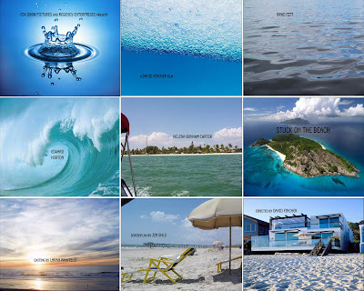
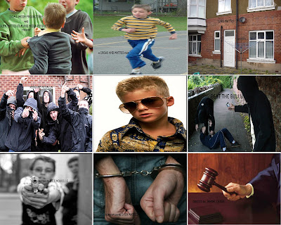


It is an first attempt to create stills of a opening sequence.
Then we did another one relating to our opening sequence pitch:

In the first picture it shown a boy getting bullied.
In the second picture it shows him running away.
In the third picture it shows his home.
In the fourth picture he sees a gang.
In the fifth picture he joined the gang and 'transformed' to a cool gangster.
In the sixth picture he is bulling the guys who bullied him first.
In the seventh picture he is getting involved with guns.
In the eighth picture he is getting arrested.
And finally in the ninth picture he gets his sentence.
We will not show every thing I listed above in the film opening. This is just the idea what the film is going to be like.
We made these nine frames in Photoshop. The first thing we did was looking through google images for good pictures to put into the grid. Then we copied and pasted these images onto a grid wich Steve transfered onto the Macs before hand.
After the pictures were in the right order we put titles onto them.
Jahmal's Pitch
Pitch 3- Cambridge gangland(regional film)
set in cambridge, a 12 year old boy who gets picked on at school, is about to change his life around, but in the wrong ways...he wants to join a gang. Blood and violence makes him even more interested in the gang world, and he even gets involved in some horrific attacks. Bullies prepare to be beaten!
This pitch is the one we are going to make an opening sequence of.
We think that it is the most doable sequence out of all of them. We are going to use my little brother as the 12 year old boy, and we are going to need props like: fake guns, knives, and gang clothing. What we need to do now at this stage, is to find more actors/actresses to be in the film opening sequence.
I think because of the guns and knives we are using, and because of the violence, we are need to film on private property.
Pitch 4 - animated feature
The crew of the spaceship 'BH23' are a partnership of bounty hunters, called "enforcer", who travel the solar system trying to apprehend as much bounties as they can.
Pitch 3 - independent movie
A family struggles - the father lost his job because of the credit crunch. He can't find any work and gets depressed. Many conflicts between his parents make Tom run away from home.
Pitch 2 - supernatural thriller
A women is pregnant. But before the baby gets born the devil appears in person. She has to make a choice, either the she survives or the child.
Brief 1 - fictional action film
A 25 year old male awakes not knowing who he is. He discovers his past by detecting signs laid out for him. The villain behind all this awaits him already.
Finished Production Logo
This is the final 'moving' video production logo that I am going to put in front of the opening sequence.
I made this production logo in Final Cut aswell as in Photoshop.
At first I created a new project and made the size the same as one frame in an PAL standard. Then I made several layers in Photoshop and named them so I was organised and knew which layer was which. After that I thoght of an title for my production company and named it after me and attached the words Film and Media Production below it. Then I looked for a nice font and colour and the I joint it all together.
In Final Cut I pasted all of the layers into the timeline and arrayed them in the order they are now in. After that I inserted some dissolves on to the layers and created an sound in GarageBand.
I think that the finished version could be improved by combining the whole, camera and Sven Mattes, together as the 'business card' which I made in the post below. (picture 2)
Thursday, 1 October 2009
Video production logo
Wednesday, 30 September 2009
Preliminary Exercise
For the preliminary exercise which we did on Tuesday, my group insisted of Liam, Charna, Tina, and me.
Our task was to create a scene in which person number 1 walked along a hallway, opened a door and had a short conversation with person number 2.
This is the final scene Liam and I edited:
We had to follow certain rules so that our final scene would look like it would in a soap opera or in a film.
These rules were:
the 180 degree rule,
match on action and
shot/reverse shot.
The the 180 degree rule is a basic rule which is mostly used when filming a dialogue. When filming a conversation the camera must always be on the same site and not crossing the imaginary line. This means the camera is always on the same shoulder/site of the actors.

Picture of
showing the
180° rule.
(Taken from
wikipedia)
The match on action we used was person number 1 going into the room. The shot began outside in the corridor and was continued inside of the room. This means that the shot was completed not in one shot but in two.
When we edited it we basically synced both shots together. This is also known as continuity editing.
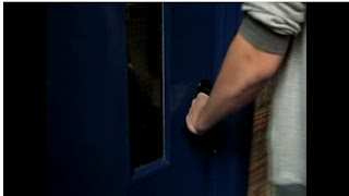
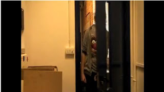
The shot/reverse shot is basically a scene repeated from another point of view. We used this technique when person 1 came into the room and person 2 reacted to it.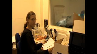
I think we did the preliminary exercise pretty good but we could improve it by better acting so it seems more realistic.
Our task was to create a scene in which person number 1 walked along a hallway, opened a door and had a short conversation with person number 2.
This is the final scene Liam and I edited:
We had to follow certain rules so that our final scene would look like it would in a soap opera or in a film.
These rules were:
the 180 degree rule,
match on action and
shot/reverse shot.
The the 180 degree rule is a basic rule which is mostly used when filming a dialogue. When filming a conversation the camera must always be on the same site and not crossing the imaginary line. This means the camera is always on the same shoulder/site of the actors.
Picture of
showing the
180° rule.
(Taken from
wikipedia)
The match on action we used was person number 1 going into the room. The shot began outside in the corridor and was continued inside of the room. This means that the shot was completed not in one shot but in two.
When we edited it we basically synced both shots together. This is also known as continuity editing.


The shot/reverse shot is basically a scene repeated from another point of view. We used this technique when person 1 came into the room and person 2 reacted to it.

I think we did the preliminary exercise pretty good but we could improve it by better acting so it seems more realistic.
Friday, 25 September 2009
Case Study Of A Film Opening
The film opening I am going to analise is of the film Fight Club.
Here is the link to the film opening of Fight Club: http://www.artofthetitle2.com/media/film/1999/fight_club_480p.mov
At the beginning of the DVD the the film studio's logo ('20th Century Fox') is shown.

After that the production's logo ('Regency Enterprises')

The next thing is that you hear music playing and these titles show and dissapear agian:
Fox 2000 Pictures and Regency Enterprises present;
a David Fincher film;
Brad Pitt; Edward Norton; Helena Bonham Carter;
Fight Club;
Meat Loaf; Jared Leto; Zach Grenier; Holt McCallany; Eion Bailey;
Casting by Laray Mayfield;
Costume Designer Michael Kaplan;
Special Make-up Effects Supervisor Rob Bottin;
Sound Designer Ren Klyce;
Music by The Dust Brothers;
Film Editor James Haygood;
Production Designer Alex McDowell;
Director of Photography Jeff Cronenweth;
Executive Producer Arnon Milchan;
Based on the Novel by Chuck Palahniuk
Screenplay by Jim Ohls;
Produced by Art Linson, Cean Chaffin, Ross Grayson Bell;
Directed by David Fincher.

(sorry you have to click onto the image if you want to see everything.)
The scence that is behind these titles represent a brain's neural network.
Which indicates that the owner of this brain is thinking heavily.
There is no introduction to the main character and there also is no introduction to the story or anything.
I think they are not introducing something because they want to capture the audience's interest by not showing anything other than the brain's neural network.
Here is the link to the film opening of Fight Club: http://www.artofthetitle2.com/media/film/1999/fight_club_480p.mov
At the beginning of the DVD the the film studio's logo ('20th Century Fox') is shown.
After that the production's logo ('Regency Enterprises')
The next thing is that you hear music playing and these titles show and dissapear agian:
Fox 2000 Pictures and Regency Enterprises present;
a David Fincher film;
Brad Pitt; Edward Norton; Helena Bonham Carter;
Fight Club;
Meat Loaf; Jared Leto; Zach Grenier; Holt McCallany; Eion Bailey;
Casting by Laray Mayfield;
Costume Designer Michael Kaplan;
Special Make-up Effects Supervisor Rob Bottin;
Sound Designer Ren Klyce;
Music by The Dust Brothers;
Film Editor James Haygood;
Production Designer Alex McDowell;
Director of Photography Jeff Cronenweth;
Executive Producer Arnon Milchan;
Based on the Novel by Chuck Palahniuk
Screenplay by Jim Ohls;
Produced by Art Linson, Cean Chaffin, Ross Grayson Bell;
Directed by David Fincher.
(sorry you have to click onto the image if you want to see everything.)
The scence that is behind these titles represent a brain's neural network.
Which indicates that the owner of this brain is thinking heavily.
There is no introduction to the main character and there also is no introduction to the story or anything.
I think they are not introducing something because they want to capture the audience's interest by not showing anything other than the brain's neural network.
Screengrab
Here is a screen grab of the original Juno opening sequence:
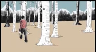
And here is our recreation of it:
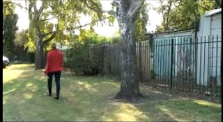
I think that we were recreated that scene pretty accurate. The location is as near as we could get. The camera angle is also rather precise.

And here is our recreation of it:

I think that we were recreated that scene pretty accurate. The location is as near as we could get. The camera angle is also rather precise.
We tried to get the location as accurate as possible as you can see we looked for trees which could be in the background as it is in the original opening.
Subscribe to:
Comments (Atom)


